I have written design docs in large organizations where they were mandatory, and in startups where nobody asked for them. I still wrote them in because I hate expensive surprises. A good design doc is the cheapest place to catch bad assumptions. It is where you discover that the problem is not what the team thinks it is, that the current system is ugly for a reason, that the migration is harder than the redesign.
A bad design doc does the opposite. It makes the solution sound inevitable, skips trade-offs, and pushes the hard questions into implementation. That feels fast right up until production starts collecting interest on every shortcut. Years ago, many teams overdesigned everything. Then Agile arrived, BDUF became taboo, and that correction was needed. But like most pendulum swings in software, we overcorrected. “Don’t overdesign” slowly became “don’t think too much.” That is usually how bad design docs fail: not in review, but later, in production. This post is about those failures.
A design doc is not documentation
A design doc is not a status update. It is not proof that architecture was “discussed” and we can start coding. A design doc is a decision document. It should answer a small number of questions clearly:
- What problem are we solving?
- What is wrong with the current system?
- What options did we consider?
- Why is this option better?
- What does it cost us?
- How will it behave in production?
- How will we deploy it, test it, observe it, and back it out?
If the document cannot answer those questions, it is not a design doc. It is a sales pitch. Because the biggest value of a design doc is that it forces a clarity. Full sentences are harder to write than bullets. They expose fuzzy thinking. They expose fake trade-offs. If you cannot explain the problem crisply in prose, you probably do not understand it well enough to build the solution.
Not every task needs a design doc.
I am not arguing for a memo before every commit. But if the change has a large blast radius, touches customer-facing behavior, takes weeks or months to implement, adds new dependencies, changes the operational model, then skipping the design doc is usually just deferred thinking. A proof of concept can help explore a technology. It cannot make the design decision for you.
That is another trap teams fall into. They build a small prototype, get something working, and then quietly promote the prototype into the architecture. A PoC can answer whether something is possible. It rarely answers whether it is the right choice once requirements, scale, operations, migration, and failure modes enter the picture.
Common design document anti-patterns
1. The doc starts with the solution
This is the most common failure. The title says:
- “Move to Event-Driven Architecture”
- “Build a Shared Workflow Engine”
- “Adopt gRPC Internally”
By page two, the author is trying to invent a problem that justifies the answer already chosen. That is not design. That is confirmation bias. A real design doc starts with pain:
- what is broken,
- who feels it,
- how often it happens,
- what it costs,
- and why now matters.
If the first section cannot explain the problem without naming the preferred technology, the doc is already weak.
2. The problem statement is vague
Bad docs hide behind words like: scalable, flexible, reliable, modern, future-proof. Those words mean nothing without numbers and constraints. Scalable to what? Reliable under what failure mode? A good design doc can explain the problem in one simple sentence. That sentence does not need to be clever. It needs to be clear.
3. No current-state analysis
A surprising number of redesigns are written as if the current system is too embarrassing to discuss. That is a mistake. Before proposing change, the document must explain:
- what exists today,
- what works,
- what does not,
- what improvements were already tried,
- and which constraints came from history rather than incompetence.
Otherwise the new design floats in empty space. Reviewers cannot judge whether the proposal is necessary, proportional, or even safer than what exists now. I have seen teams rebuild old mistakes in new codebases because nobody bothered to explain why the old system looked the way it did.
4. No explicit decision points
One of the easiest ways to waste a review is to make nobody sure what decision is actually needed. You invite ten people. You walk through twelve pages. You get comments on naming, schemas, and edge cases. Then the meeting ends with “good discussion.” Good discussion about what? A strong design doc names the decisions up front:
- Should this stay synchronous or become asynchronous?
- Should we improve the current system or replace it?
- Should we optimize for near-term delivery or long-term reuse?
- Should this roll out in phases or all at once?
If reviewers do not know what they are approving, the meeting is not a design review. It is architecture theater.
5. Only one option is presented
A doc with one option is not doing design. It is asking for permission. A real alternatives section should compare at least:
- the current system,
- an incremental improvement,
- a larger redesign.
And it should evaluate each one with the same criteria like complexity, delivery time, migration cost, operational risk, long-term fit, rollback difficulty, etc. Weak alternatives are easy to spot. They exist only to make the preferred answer look inevitable. That is not analysis. That is stage lighting.
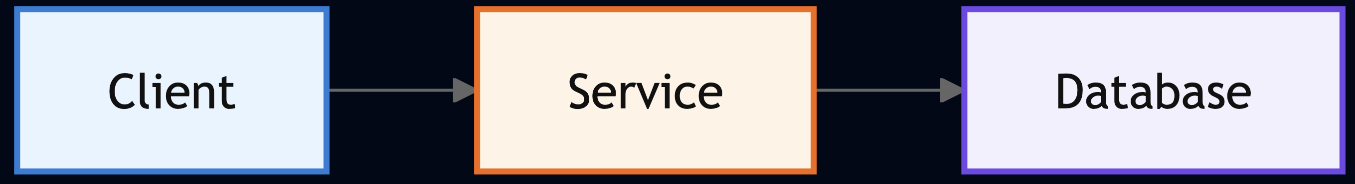
6. The doc is all diagrams and no behavior
The bad architecture diagram looks clean because it omits every painful thing.
What is missing?
- retries/timeouts,
- queues,
- failure paths,
- consistency model,
- startup/shutdown behavior,
- observability,
- rollout boundaries.
A useful design doc explains system behavior, not just topology.
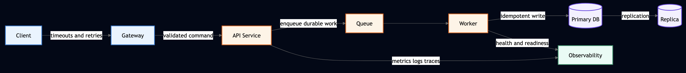
A diagram should force the hard questions, not hide them.
7. “Flexible” is used to hide indecision
This shows up everywhere like generic workflow engine, abstraction layer, configurable state machine, future-proof resource model, plugin architecture, etc. Flexibility is not free. It adds code, states, tests, docs, and future confusion. If the document argues for flexibility, it should name the exact variation it is buying. Otherwise “flexible” usually means “we do not want to decide yet.”
8. No stakeholders, only authors
A design doc written as if only the authors matter is usually missing half the constraints. A strong document names:
- customers/downstream consumers,
- partner teams,
- SRE or operations owners,
- security and compliance reviewers,
- migration owners,
- and the people who will actually operate the result.
9. No supporting data
Many bad docs are built entirely on intuition like ”customers want this”, “performance is a concern”, “the current solution does not scale”, etc. Maybe but show me. Use data where it matters:
- latency numbers,
- failure rates,
- support burden,
- cost profile,
- customer pain,
- migration friction,
- adoption gaps.
And if the data is incomplete, say so. Honest uncertainty beats fake precision every time.
10. The document ignores requirements and jumps to implementation
A lot of docs rush into endpoints, services, queues, schemas, state machines, etc. Before they have separated:
- business requirements,
- technical requirements,
- non-requirements,
- and nice-to-haves.
That is how teams build the implementation they like instead of the system the problem actually requires. A good design doc works backward from requirements. It does not reverse-engineer requirements from the chosen design.
11. Functional requirements are detailed, non-functional ones are hand-wavy
This is one of the most expensive mistakes in design docs. The author carefully explains resource models and workflows. Then non-functional requirements get three weak lines like must be secure, must be scalable, must be observable. A serious design doc must be concrete about:
- latency and performance,
- availability and recovery,
- scale assumptions,
- capacity limits,
- security boundaries,
- privacy impact,
- cost,
- testing,
- operations,
- visibility,
- monitoring,
- alarming,
- and release strategy.
Most painful incidents come from things that were “out of scope” in design but very much in scope in reality.
12. Observability is missing or lacking
This is the fastest path to production blindness. Bad docs do not define:
- what metrics matter,
- what logs matter,
- what traces matter,
- what dashboards must exist,
- what alerts page on-call,
- how operators diagnose dependencies, latency, or error spikes.
If the document cannot answer, “How will on-call debug this at 2 a.m.?” it is incomplete.
13. No test plan
“Unit tests will cover this” is not a test strategy. A real design doc should say how the change will be validated across:
- unit tests,
- integration tests,
- end-to-end tests,
- load tests,
- canaries,
- failure injection,
- rollback validation,
- and game days where appropriate.
A system that cannot be tested safely cannot be changed safely.
14. No deployment or release plan
The code path is described. The rollout path is not. Bad docs ignore:
- phased rollout,
- canaries,
- feature flags,
- cell or region rollout,
- migration sequencing,
- readiness checks,
- automatic rollback,
- launch criteria,
- and customer onboarding gates.
Good design does not stop at build-time behavior. It includes how the system gets to production without hurting customers.
15. No rollback story
A deployment section without a rollback section is half a design. What happens if:
- the canary regresses latency,
- the schema change is wrong,
- the queue backs up,
- downstream clients fail,
- or the new workflow leaves resources in a mixed state?
Every risky design needs a big red button. Not a vague hope. A real action:
- stop traffic,
- disable the feature,
- revert the config,
- drain the workers,
- route to a degraded path,
- return a controlled error,
- or restore the last known good state.
If rollback is an afterthought, the rollout plan is fiction.
16. The doc describes the steady state but not the failure state
Most architecture docs assume every dependency is healthy and every component behaves. Real systems do not. A strong design doc explains:
- what happens when a dependency times out,
- when startup occurs during an outage,
- when shutdown interrupts in-flight work,
- when a rollout fails halfway,
- and when rollback itself is imperfect.
17. The document is too long because it has no spine
Some docs are not too detailed. They are simply undisciplined. They include: screenshots, random notes, every edge case ever mentioned, and multiple separable topics jammed into one review. If the document cannot be read and discussed in one serious session, it is probably trying to do too much. Split the deep dives. Split the migration plan. Split the deployment details. Keep the core decision document focused on the actual decision.
18. The appendix carries the real argument
The main doc is vague. The important material is buried in appendices or links. That is backwards. The appendix should support the argument, not contain it. If reviewers need four extra docs to understand the recommendation, the author has not done the work.
19. The writing is vague because the thinking is vague
This is where writing quality matters more than most engineers admit. Weak design docs hide behind passive voice, overloaded jargon, bullets that dump unrelated ideas, and paragraphs that never land a clear point. Bad writing is often a design smell. The fastest way to discover a weak design is often to force it into full sentences. Full sentences make you commit to claims, assumptions, and trade-offs. They remove the hiding place. Writing is not separate from design. Writing is where the design proves whether it makes sense.
20. The review process is treated as ceremony
This is another place where teams lose value. They schedule a review too early, or too late. They invite the wrong people. They do not define the decisions needed. They edit the document while people are reading it. They leave without summarizing outcomes. Then they schedule a second review without properly addressing the first. A review should have a point:
- what decision needs to be made,
- who must be in the room,
- what feedback is blocking,
- what can be handled offline,
- and what the next step is.
Reviewer time is expensive. Churn is self-inflicted damage.
21. No path forward after approval
Another common failure: the document ends at “approved.” No phases, milestones, follow-up docs, migration steps. Approval is not the end of the design. It is the start of accountable execution. A design doc should leave the reader knowing what happens next.
22. No ADRs or recorded decisions
Despite design discussions for tradeoffs and acceptance of a few choices are accepted, if the decisions are not recorded then nobody will remember why they were made. That is how architecture drifts.
If a decision matters enough to debate, it matters enough to record. A common tool for this is an Architecture Decision Record (ADR). An ADR is a short document, usually one page, that captures a single decision: the context that forced it, the options considered, the choice made, and the consequences. It is not a design doc. It is a permanent note attached to the decision so that future engineers can read why the system is the way it is.
23. The doc has no long-term point of view
This appears in two forms. The first is naive short-termism: the document solves the immediate issue but never explains where the architecture is heading. The second is fake future-proofing: the design becomes bloated with speculative flexibility. The right middle is simple:
- say what this design intentionally does not solve,
- state how it fits long-term goals,
- and explain whether it can evolve in stages.
24. The document reads like it is trying to get approved, not trying to be right
This is the meta anti-pattern behind all the others. You can feel it when reading because the tone is too certain, the trade-offs are too clean, the unknowns are hidden. the alternatives are weak, etc. The best docs do not sound like that. They sound like real engineering:
- here is the problem,
- here is the current state,
- here are the options,
- here is why I prefer this one,
- here is what it costs,
- here is what can go wrong,
- and here is what I still do not know.
That tone earns trust. The polished sales pitch does not.
The essential sections every good design doc should include
This is the part too many teams skip or dilute. If these sections are weak, the design is weak.
1. Executive summary and purpose
Keep it short. State the problem, the proposed direction, and the exact decision needed. This section should make it obvious why the reviewer is reading the document.
2. Background, problem statement, and current state
Explain what led to this proposal, what is working, what is not, what previous attempts were made, and why the current system is no longer enough.
3. Proposal, stakeholders, and supporting data
This is the core decision section. It should include the preferred option, stakeholders, supporting evidence, assumptions, constraints, risks, and whether the decision is reversible or one-way.
4. Architecture
This section should include a diagram, but also explain components, interactions, dependencies, data flow, control flow, consistency boundaries, and failure paths.
5. Alternatives
Compare the chosen approach with real alternatives: current state, incremental improvement, broader redesign. Use the same criteria for all of them. Be candid about the downsides of your preferred option.
6. Functional requirements
This section should cover interfaces, workflows, dependencies, data model or schema changes, lifecycle states, scalability assumptions, and reasons for adopting new technologies.
7. Non-functional requirements
This section should include performance, scale, availability, fault tolerance, rollback and recovery, security, privacy, compliance, testing, cost, operations, visibility, monitoring, and on-call support.
8. Future plans, release plan, and appendices
It should close with phased delivery, rollout gates, migration plan, open questions, references, FAQ, glossary, and a change log. Do not use appendices to smuggle in major new arguments. Use them to support the story the main document already told.
9. Decision log
A design doc captures the proposal. An ADR captures each significant choice that came out of the review. After approval, for every decision that was seriously contested or has long-term consequences, write a one-page ADR. A minimal ADR has five fields:
# ADR-[number]: [Short title of the decision]

**Date:** YYYY-MM-DD
**Status:** Proposed | Accepted | Deprecated | Superseded by ADR-[n]
**Deciders:** [Names or teams]

## Context
What forced this decision? What constraints, requirements, or failure modes made this a real choice?

## Decision
What was decided? State it as a single clear sentence.

## Alternatives considered
What else was on the table? Why was each rejected?

## Consequences
What does this decision cost? What does it enable? What is harder now?
That is enough. Do not over-engineer the template. The goal is that an engineer two years from now can read this and understand why the system is shaped the way it is, without having to find the original author.
Writing advice most engineers ignore
This part matters because bad writing usually exposes bad thinking.
- Keep the narrative tight: A design doc should read like an argument, not like a paste dump. The table of contents should tell a story: problem, current state, options, recommendation, trade-offs, rollout. If the table of contents itself is confused, the design probably is too.
- Use full sentences: Bullets are useful. They are not enough. Full sentences force the author to commit to claims, assumptions, and trade-offs. They expose fuzzy logic faster than any architecture diagram.
- Keep it short enough to review: If the document cannot be read and discussed in one serious session, split it. High-level design, deep dives, migration strategy, deployment details, and error-handling internals do not always belong in the same review.
- Use diagrams carefully: Diagrams should reduce ambiguity, not add decoration. Name them, keep them consistent, and use them to show boundaries and flows.
- Define acronyms once: Every team overestimates how obvious its vocabulary is. The doc should not require tribal knowledge to parse it.
- Do not hide the hard part in links: Links reduce clutter. They do not replace the core argument. The main decisions must be understandable from the document itself.
What good looks like
A good design doc is not flashy. It is specific, honest and operational. It makes trade-offs visible. It gives reviewers something real to approve or reject. Most importantly, it treats writing as engineering work. The quality of the writing often exposes the quality of the thinking. If the problem is fuzzy, the writing will be fuzzy. If the decision is weak, the language will hide behind buzzwords. If the architecture has no operational model, the document will go strangely quiet around deployment, monitoring, and rollback.
Final thought
People say design docs slow teams down. Bad ones, ceremonial ones, bloated ones do. Good design docs save time because they move the expensive mistakes earlier, when they are still cheap. The real waste is not spending an extra day writing a serious design doc. The real waste is spending eighteen months undoing a design that nobody challenged properly because the document never forced the right conversation. That is how not to write a design document. And the second most expensive waste is spending months figuring out why a past decision was made because nobody wrote it down. That is what ADRs are for.